Why your website is not bringing in enquiries
Why a website stops producing enquiries, how to find the one link that is broken, and what to fix first.
Short answer
A website is not bringing in enquiries when one link breaks between the right visitor and a clear next action: the page is too slow to wait for, the offer is not clear, the company is not convincing, or the enquiry itself goes nowhere. Almost always it is one specific link, not all of them.
Contents · 8 questions
- Why do people visit the site and never get in touch?
- Does the site load before the visitor gives up?
- Is it clear within seconds what the company does, and for whom?
- Does the service page answer what a client asks before calling?
- Can a visitor see real work and a real person who will answer?
- Does the form work, and does the enquiry actually arrive?
- What changed on one real school website?
- What should be fixed first?
Why do people visit the site and never get in touch?
A visitor and a potential client are not the same thing. If people arrive looking for jobs, general information, or a service you do not offer, more traffic will not produce more enquiries.
Separate the traffic problem from the conversion problem first — they are two different repairs.
If almost nobody suitable arrives, the work is visibility and separate service pages. If the right people arrive and still do not write, the work is speed, offer, trust and the enquiry path. This one split usually decides whether anything else is worth doing.
Does the site load before the visitor gives up?
Most people open a site on a phone. Not in ideal conditions: on the move, in a hurry, on a weaker connection, with very little patience.
If a site takes 5–6 seconds to load, some people simply never see it.
This takes minutes to check. Put the homepage and the most important service page through PageSpeed Insights. A poor mobile score is not a technical detail — it costs enquiries before anyone has read the offer.
The usual fixes are unglamorous and they work: compressed images, modern image formats, decent hosting, and fewer unnecessary plugins.
Is it clear within seconds what the company does, and for whom?
Homepages often try to say everything at once: experience, values, technology, services and company history.
If the headline would suit almost any competitor, the visitor has to work out the point — and does not.
A person needs three things quickly: what is done here, who it is for, and what the next step is. A good page does not just present the business — it helps someone recognise their own situation.
Usability researcher Jakob Nielsen, co-founder of Nielsen Norman Group, put the timing on it (nngroup.com, 2011): “Users often leave Web pages in 10–20 seconds, but pages with a clear value proposition can hold people’s attention for much longer.” In practice: if the first screen does not say what this is and who it is for, nobody reads the rest.
Does the service page answer what a client asks before calling?
A service name and a contact form are rarely enough. Before getting in touch, people want to understand the scope, the process, how the price is arrived at, the timeline, and what happens after launch.
One important service — one page of its own.
When five different services are stacked onto a single page as a short list, neither search engines nor clients can see the specialism. Someone looking for one specific service wants a specific answer, not a page where it is mentioned once.
The same applies to places. “We work throughout the country” is not a strategy — it is a line in the footer. A location page only works when it carries real context, not the same text with the city name swapped.
Can a visitor see real work and a real person who will answer?
A site can look good and still not convince, especially when the company is unfamiliar.
Trust comes from evidence tied to the decision at hand, not from a row of testimonials.
The common mistake is hiding everything: reviews live only on a Google profile, work is not shown, prices are never mentioned, and the company describes itself so abstractly that it is unclear who would actually do the job. The bigger the cost or risk, the more clarity is needed before contact.
Worth checking plainly: are the contact details identical everywhere, does the portfolio show a problem that was solved, do prices contradict each other across pages, and is it visible who answers an enquiry.
Does the form work, and does the enquiry actually arrive?
Even a good offer fails if it is unclear how to get in touch, the form asks for too much, or a submitted enquiry disappears. A vague “Learn more” button does not say what will happen.
Walk the path from the service page to a saved enquiry yourself, on a phone.
All the way through: is it clear what is being asked for, does the form accept the data, does the person get a confirmation, is the enquiry stored anywhere, and is there an agreed time to reply.
Turn on tracking at the same time — at minimum Google Analytics, Search Console, and recording of the actions that matter. Without it, decisions become opinions: one person thinks the design needs changing, another that the ads are broken, and there is no data to say which guess is right.
What changed on one real school website?
Forvardas is a private school in Vilnius. On its previous site, information was scattered, old phone numbers were still listed, and some enquiries were being lost.
Enquiries appear when visibility, information and their handover work as one system.
After the rebuild, programmes, admissions and prices were separated into clear pages, registration became reachable from the places that matter, and enquiries started being saved to a table. The first enquiries recorded through the site arrived within the first month.
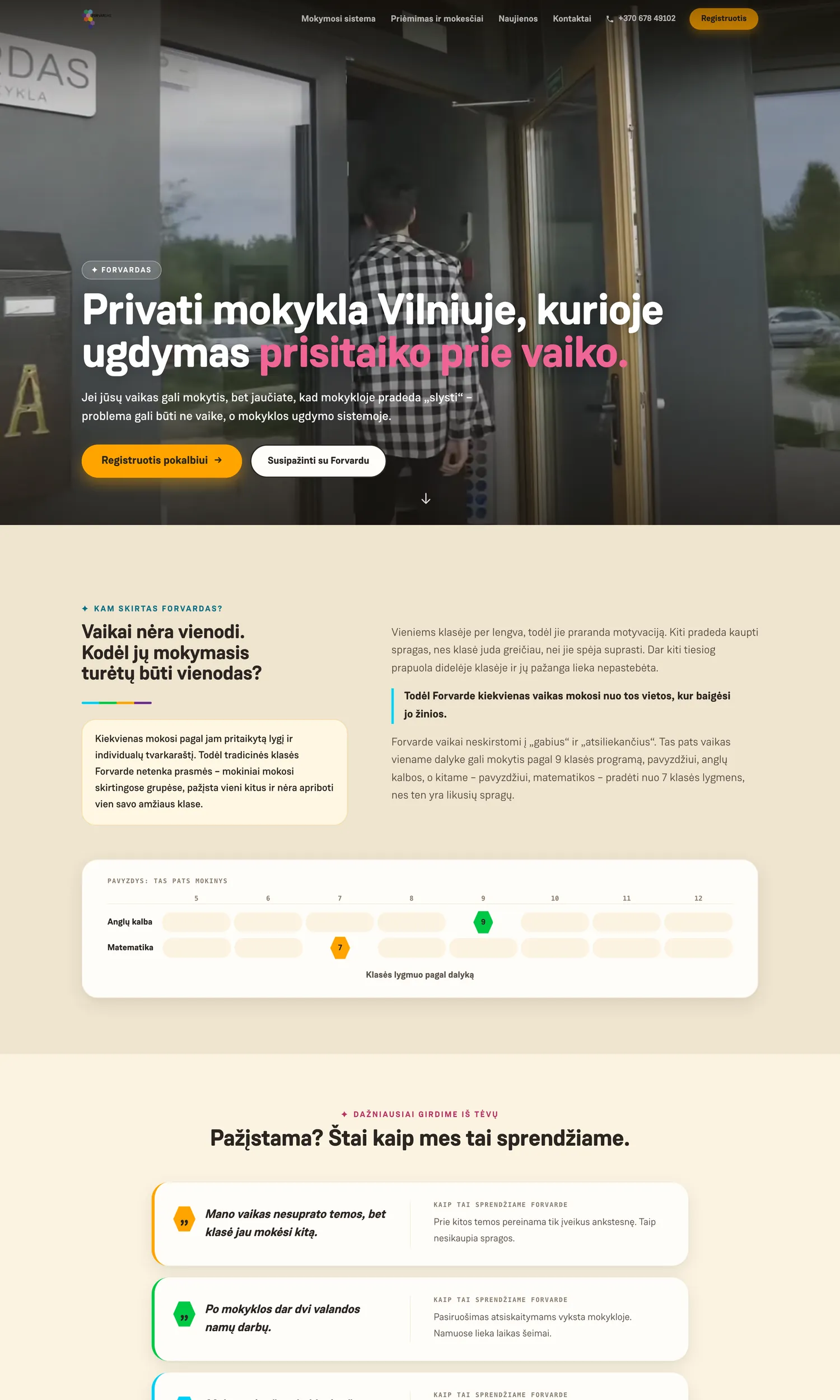
This is our own project, not a guarantee for another business. It is used to show the reasoning, not a universal result.
What should be fixed first?
A site that is not bringing enquiries rarely needs rebuilding all at once. Start with the one link that is broken.
The first fix has to match the place where the potential client is actually being lost.
Each symptom has its own place to start from. Not the whole site at once.
| where it breaks | what to check first |
|---|---|
| no suitable visitors | visibility and separate service pages |
| they arrive and leave at once | speed and the first screen |
| they read and do not get in touch | the evidence and the next step |
| they start the form and abandon it | the length of the form — on a phone |
Sometimes rewriting the first screen, fixing one service page or repairing the form is enough. Sometimes the structure itself is the problem. That call should come from a check, not from the urge to start over. A website is a working business tool, not a one-off project that is launched and forgotten.